SlimScript
Streamlining the subscription management process
About.
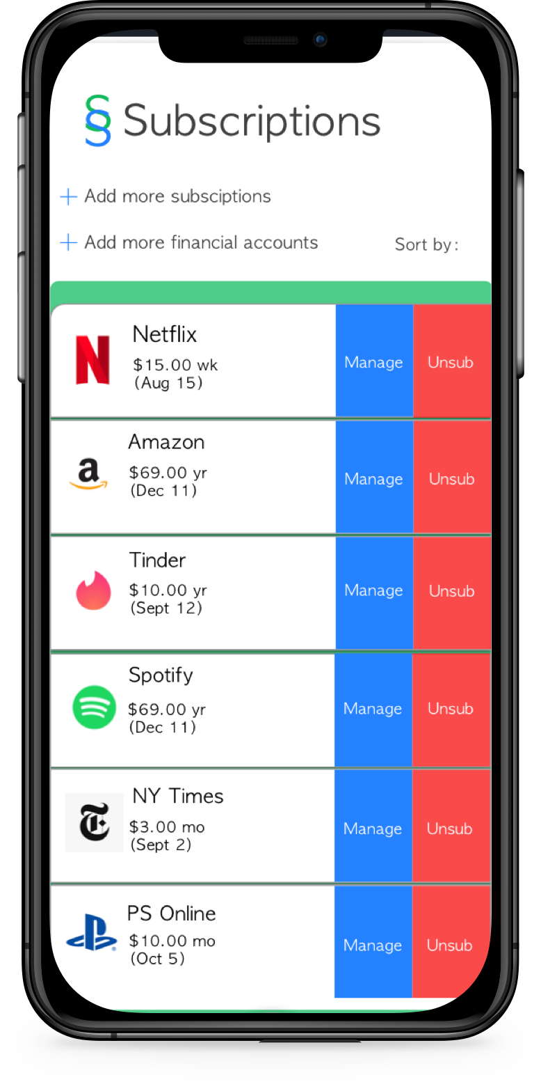
SlimScript is a subscription management platform that allows user to manage, pay and cancel subscriptions in a seamless way.
Problem.
With the subscription based model continuing to grow, users find themselves frustrated with having to manage dozens of subscriptions at a time. These frustrations also come with a financial cost: as subscription bloat grows, users often don’t realize how much money is being spent on unnecessary or recurring subscriptions. This problem could be resolved if users had an easy way to manage their subscriptions, monitor them, and cancel them easily when needed.
Solution.
Designing an application to:
Easily keep track of costs and manage subscriptions.
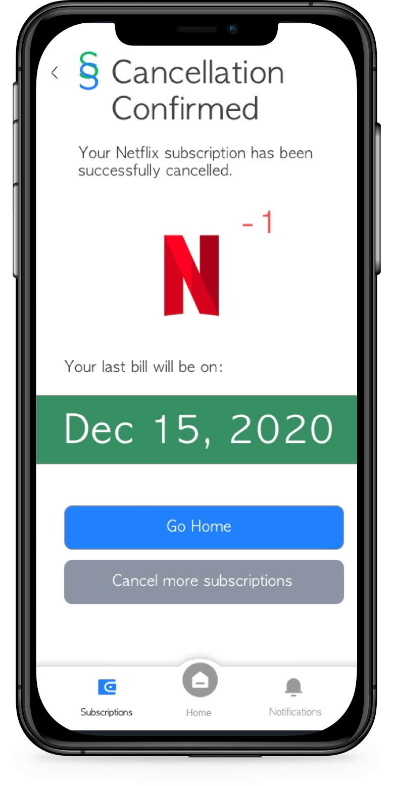
2. Cancel subscriptions as quickly as possible.
3. Remind users of when a subscription will charge them.
Designer Role
Discovery.
To gain a deeper understanding of the subscription bloat problem, I did some market research to determine how the subscription model would grow in the future and a competitive analysis to get a sense of how other applications were approaching the issue.
Quantitative Analysis
71% of adults across 12 countries have subscription services
By 2022, 53% of all software revenue will be generation from a subscription model
By 2023, 75% of organizations selling direct to consumers will offer subscription services
Qualitative Analysis (Competitive)
Users of similar app competitors expressed satisfaction with subscription management apps , which included:
Helped increase savings
Ability to cancel subscriptions
Easy of managing large amounts of subscriptions
Ability to see all subscriptions in one place
But users of competitive apps had the following issues:
Bank account linking issues
Hidden fees
Lack of prompt support
User Personas
Using insights I gained from initial research, I created user personas to envision potential users of the app and to guide design principles for future use cases. These user personas reflect a general consensus of potential users and also helped prioritize what features should be emphasized throughout the design.
Design.
Using insights gleaned from research and synthesis and the creation of user personas, I was able to create the information architecture for a potential subscription management app before moving onto low fidelity wireframes.
User Map
The user map helped inform future design decisions in low and high fidelity and provided a general roadmap for app design.
Low Fidelity Wireframes
Drawing upon my research, which helped discover what users wanted in a subscription management app, and using the information architecture map I designed, I began building out the application, making sure user priorities of seeing their total subscriptions, managing their subscriptions and having the ability to easily cancel subscriptions were preserved. I made a design decision to keep the dashboard very number centered so that users would always know how much money was being spent and the amount of subscriptions they had. Those were the most important bits of information to a user based on research and the rest of the application would flow from that prioritized information.
Brand Guidelines and UI Elements
Before moving to high-fidelity design, I settled on general branding, iconography and button architecture. Since the color green is mostly associated with money, shades of green were selected to represent money being managed. Additionally, since blue is the color most associated with trust, I selected it as another primary color to represent the trust the user would want to feel using an app that handles money. These branding guidelines were used as the foundation for building out the general look of later designs.
Validate.
User Testing
User Testing was performed in low fidelity with 5 individuals in person to quickly assess overall usability and potential errors. Insights from low fidelity user testing were then integrated and incorporated in the high fidelity design, wherein 5 additional remote tests were conducted before product finalization.
In-person testing results (Low fidelity)
There should be an option to categorize subscriptions
Cancellation language should be clarified
More customization should be allowed, especially in the ‘Remind me to pay section
Remote Testing (High fidelity)
Revise nav bars for easier accessibility
Increase size of text to increase readability
Relocate CTA on dashboard of the screen
Resulting Product.
The final product, incorporating feedback from user testing and integrating branding and UI guidelines, allows the user to seamlessly manage and cancel subscriptions, set reminders for upcoming payments, and monitor overall spending on subscriptions.


