UVOTE - The Future of Voting
ABOUT
UVOTE was designed as a fully integrated voting platform that solves issues and pain-points many voters face before casting their vote. UVOTE connects them with streamlined, localized access to information about upcoming elections, voting logistics, local issues, candidates and any other necessary voting information needed to make informed decisions.
The UVOTE application also explores the concept of how voters of the future could vote securely online in an upcoming election.
THE ISSUE
As the United States faces a new era of political uncertainty, there is one underlying structural issue that sets it apart from other countries: lack of voter turnout, particularly among the youth. Potential voters find the voting process archaic and have difficulty navigating the process from start to finish.
With politics increasingly at the forefront of national discussion, an application that makes the voting user experience easier would potentially increase voter turnout and engagement in upcoming elections.
THE SOLUTION
Designing an application that would increase voter turnout among youth by:
1. Consolidating information that voters need to make informed choices during an election
2. Streamlining the process by which voters can track and be notified about upcoming elections
3. Increasing engagement between voters and digital platforms
4. Improving the overall experience of voting from start to finish by making the process more pleasing
DISCOVERY
To gain better insight about voter trends, habits and feelings, I decided a combination of different research methods should be utilized to fully understand the voter behavior. To start, I conducted initial exploration consisting of quantitative and qualitative research to gain a clear understanding of broad voting patterns in the United States. I then combined the results of this research with interviews of voters who were unlikely to vote in upcoming elections. By analyzing the behavior of unlikely voters, pain-points throughout the voting experience could be more easily surfaced. These insights helped me understand what core issues throughout the voting journey are preventing voters from casting their votes and how these issues could possibly be remedied to improve the overall experience and make these individuals more likely to vote.
DESIGNER ROLE
Research
Results of initial background research on voters values indicated a disconnect between perceived views of the importance of voting and the actual action of getting out to vote. These results demonstrated a need to bridge the enthusiasm gap and align voters - particularly younger ones - with their underlying values. The research also uncovered that there was a significant group of voters who didn’t vote in the last election, but who could be convinced to do so in the future.
User Interviews
User interviews consisted of interviews with unlikely voters because these voters would be more likely to be discouraged by inconveniences and more easily pinpoint issues with the voting process. As I interviewed five unlikely voters, a pattern emerged: the source of voter apathy was a result of feeling unempowered and uninformed. Throughout their interviews, users expressed a desire for a system of voting that was simpler, that provides streamlined information about candidates and one that results in an immediate impact and reward of the decision to vote.
Pain points consisted of not knowing where to go to get information for upcoming elections, not feeling informed enough about issues being voted on, and a general sense of disengagement with the overall process.
“I feel like my vote doesn’t count.”
“The outdated voting system doesn’t conform to modern day society.”
“I wish the information I needed to vote was consolidated somewhere.”
“If we brought the vote to the people it would make voting easier.”
2. DEFINE
Affinity Mapping
To help analyze patterns discovered in research, insights from interviews were synthesized into an affinity map which categorized fundamental concerns potential users have of the voting process. Using this method, I determined there were 5 buckets of methods voters thought the voting process could improved. They included:
Logistics and process of voting;
Solving apathy and vote dilution;
Social engagement;
Accessibility & streamlining; and
Information linkage & issues.
3. IDEATE
User Personas and Stories
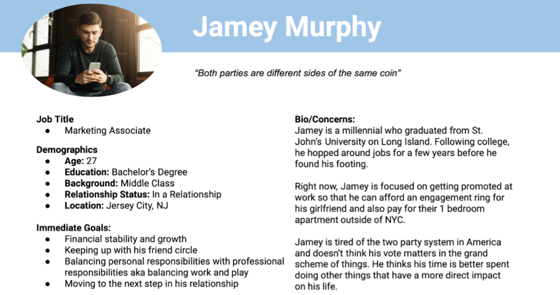
Based on affinity mapping and research results, persona cards were created representing potential users of a voting information platform and to give broader insight into fundamental needs this application would have. User stories - sorted by likelihood - zero’d in on the main issues a potential voting application could solve by putting myself in the mindset of the user.
Information Architecture
After gaining a sense of potential use-cases from building out user personas, synthesizing information and defining the most important issues the voting application would solve, I was able to put together the initial information architecture that would serve as the bedrock of the design buildout. This information architecture helped visualize the path a user would take through the potential application before moving on to sketching and lower fidelity designs.
4. Design
With informational architecture in place and a clear vision of the product, I put ideas to paper and began sketching the app as envisioned, prioritizing a simple and straightforward voting experience, which would reduce frustration and make the process more enjoyable. After the initial screens were sketched out on paper, I refined them in low fidelity mockups in Figma, so that the application could begin to take shape both in form and function.
Low Fidelity Wireframes
Usability Testing
After the low-fidelity mockup screens were designed, I was able to test out the designs with real world users to see if the application was easy to use, identify any potential errors or frustrations, and see if it resolved any of their initial frustrations with the voting experience. Usability testing consisted of 30 minute remote sessions with five individuals while observing their interactions with the application as I asked them to perform specific tasks. Throughout the interview, I collected information on their likes and dislikes and used those results to guide future designs in high fidelity.
While users enjoyed the overall experience, there were a few issues uncovered, mainly:
Certain buttons did not function as intended and did not navigate to the correct page
Text was sometimes hard to read on colored backgrounds
To remedy this, I iterated on future designs by:
Clarifying button copy to give clear sense of direction
Increasing text size and contrast to increase readability for users
Adjusted navigation and removed any redundancies to ensure proper usability
Moodboard
While low fidelity mockups provided the structure for the app, as it made its way to a higher fidelity design, the overall feel, look and personality of the application also had to take shape. A moodboard was used to brainstorm the underlying tone of the application, as well as the visual aesthetic and ‘feel.’
Branding and UI Elements
Since users expressed a desire for a simple, motivating app, I decided to move forward with a design that was minimalist and easy on the eye, utilizing colors, icons, visual effects and typography to evoke a sense of cheerfulness, simpleness and motivation. These branding and UI elements also matched the tone and aesthetic of the moodboard, providing a unified experience.
5. Results
The UI elements and branding guidelines were then incorporated into higher fidelity designs and mockups, which were tested with users remotely to identify any final usability issues. Following a conclusion of the design process and after several iterations using insights gained, a fully integrated voting application was successfully designed in line with the critical user need: making voting easier.


